SAVE TIME + STOP PROCRASTINATING

bigstock-Calendar-6578522.jpg

We all do it. Put off phone calls. Delay scheduling medical appointments. Wait until the evening of April 14th to do our taxes. We find reasons to avoid doing even the smallest task. The experts actually have a phrase for it—“postponement problems.” The reality is procrastination can be costly both in business and in personal life. I don’t know many people who have the luxury of procrastination these days. And as business owners procrastination could literally affect our livelihood. So we take this procrastination business seriously. Here are some tips that help us to stay on point:

Tackle your biggest task first. Finishing the largest task on your to do list will give you an extra jolt of energy. You can then parlay that momentum into completing the rest of the items on your to-do list.

 Reward yourself. Procrastination comes from a lack of motivation. Well, the best way to self-motivate is to reward yourself for buckling down. The experts call it “positive reinforcement.” Whether you’re a human or Pavlov’s dog—positive reinforcement is the best way to transform inertia into progress. Try it. You’ll be amazed at how motivating a chocolate bar or a glass of red wine can be.

Find your flow. When you have a deadline, fixate on getting the nuts and bolts of your project done first. Find your flow. Flow is that time when you’re totally absorbed in what you’re doing and making great progress. The worst thing you can do during this time of flowing productivity is to stop what you’re doing and critique. Get the lion’s share of the job done first. Go back later when the heavy lifting is done for critiquing or editing.

Break your project into smaller chunks. It’s easiest to stall out on larger projects since they require more steps. Break your large project into smaller chunks. Make a check list. Post it somewhere visible. Marking off items will help keep you motivated and focused for the duration of the project.

Turn off those negative tapes. When a to-do list looms it’s easy to get those negative tapes rolling in your head. “How will you ever get this done?” “Why did you wait until now to start this project?” It can really turn into a mind game. Swap those nagging tapes with ease-inducing ones. Replace “Why didn’t you start this sooner,” with something positive like, “Completing tasks is something I do well.” It may sound a little head-shrinky but it totally works. It’s hard to work under stress—especially when it’s self-induced.

Make a check list. An old fashioned check list is still one of the best tools for getting things done. Placing a big check or x next to a completed task feels good and energizes you for more work.

Create a distraction-free work space. If you’re already having difficulty getting work done any distraction will easily pull your attention away. Don’t set yourself up for failure by being ear shot of the TV, barking dogs, noisy neighbors or any other distraction. Create a place where interruption is highly unlikely. Put on some noise-cancelling headphones if necessary. Stuff your iPhone under a pillow so you can’t hear it. However, if you insist on keeping your iPhone near add RescueTime—an app that blocks certain or all incoming texts, alerts, messages, etc.

“Procrastination is the thief of time, collar him.” 
― Charles DickensDavid Copperfield

“Someday is not a day of the week.” 
― Janet Dailey (American Novelist)

HEY, ZEN IS IN!

Taking down the Christmas wreath or packing away the Hanukah Menorah always accompanies a dash of sadness. On the flip, we love all the “Best of” and “Trends to Watch Out For” lists that come out in January. Scrolling through predicted trends and styles on the Internet quickly erases any nostalgic pangs brought on by the year’s end. This January, we took our annual perusal a step further and compiled our own list. Below are just a few of the common design and home renovation trends we found while surfing the web and pillaging the magazine racks at Barnes and Noble. One thing is for sure—Zen is in. Look for anything earthy, earth-friendly, soul-easing or mantra-inspiring. From recycled glass tiles for the shower to re-purposed just-about-everything. In 2014 tranquility is the new kid on the block.

In the Bathroom- This year, homeowners want to bring nirvana right into their bathrooms by turning their bathroom experience into a spa-experience. They no longer view their daily prep time shaving and showering as a chore but as an opportunity to tap into some much needed serenity before heading out for another hectic day. Expect to see open, airy bathrooms with heated floors, floating sinks, custom storage, large curb-less showers and free-standing tubs to help create a routine of daily tranquility.  

In the Bedroom- Homeowners yearn to create a Zen-like sanctuary in their bedrooms this year. To do this, the multifaceted gray and many shades of blue will be called upon to usher in subtlety and calm. Natural materials and warm woods will also bring harmony and ease. Quiet niche areas with tufted armchairs and accent pillows will provide a cloistered place to exhale at the day’s end. Functionality, however, is also important. Expect to see compartmentalized storage, shoe walls and open vanity areas.

In the Kitchen-Non-toxic earth-friendly cabinetry is in as well as floating shelves. Simple countertops and minimalists designs are widely predicted as are energy-efficient appliances that blend naturally into the kitchen landscape or are hidden away from plain view entirely. Remodels will also utilize more renewable materials like bamboo. Additional design features will work hard to incorporate the local climate (e.g. considering daily sun paths to take full advantage of natural lighting).

COLOR CONSCIOUSNESS- Part Two

Green

Lighter greens establish a cheery and playful atmosphere. Deeper greens induce warmth and den-like elegance. Eco-consciousness color forecasters tag green as the new “it” color. But be sure to temper your green. A shade too dark and it becomes murky, too light and it ends up looking yellow. Strike the right balance and you’ll evoke a healthy homestead feeling ideal for a country home or forward-thinking urban setting.

Gray

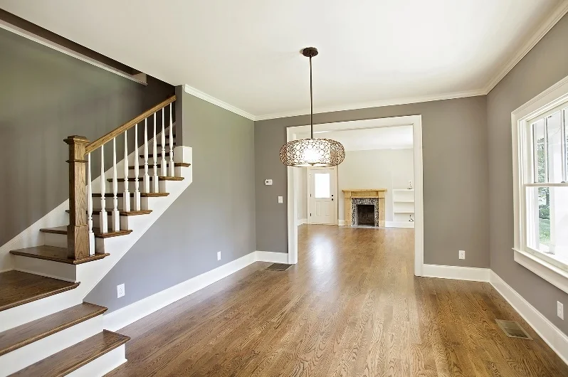
We love gray because it’s dependable, sophisticated and soothing. Gray is also very versatile. It pairs well with white for a fresh look and black for a more modern one. Use dark gray shades like slate or cobalt for trim and an über-modern look. We love utilizing gray when highlighting architectural exteriors. Gray and crème is an elegant and classic color combination. Like blue, gray evokes inherent calmness and serenity. Gray is a wonderful backdrop for earth tones and wood. Gray does have a duplicitous nature though. Depending on how it’s used—it can warm you up or cool you down.

White

White is your get-out-of-jail-free card. You simply can’t go wrong with white. White is the color of purity, clarity, and rebirth. Of course, an overabundance of white can feel hospital-like. So treat your blank white canvas walls to paintings and framed pictures that best reflect your character. Create a “living gallery” of original artwork and photographs. White is the most popular color choice for home exteriors and can augment any interior space as well. Remember white comes in a multitude of hues—from Cottage White to Navajo Sand. Just because it’s popular doesn’t mean it has to be boring.

Brown

Brown creates feelings of warmth and security. Down-to-earth brown and its first cousins coffee and espresso are excellent accents for woods, rattans, and wicker. Window sashes of Victorian homes were often painted darker brown. As well, brown was a frequent flyer house color for Sears and Roebuck bungalow homes of the early 20th century. Use brown cautiously with interiors, too much brown can create a claustrophobic, cave-like feeling.


Thanks for reading!

COLOR CONSCIOUSNESS - Part One

paintlids.jpeg

COLOR CONSCIOUSNESS

The effects of color are often underestimated. We respond to color in both a conscious and an unconscious way. Color holds power. When there’s a house or architectural product that calls to us but we can’t put a finger on why—it’s likely the color. In fact, psychologists say over 50 percent of our initial reactions involve color. Now we even know which colors evoke which mood. Here’s a short primer for you to explore colors and the moods that they inspire:

Yellow

Yellow produces two opposing moods—happiness and anxiety. Initially, yellow produces joy and hope but if you’re surrounded by yellow for too long it may increase irritability. Because of this yellow may not be the color choice you room in which you spend enormous amount of time. Anxious yellow can be hushed by harmonizing it with other colors.

Purple

Like yellow, purple evokes bipolar moods of relaxation and stimulation. Purple is favored by creative-types because it stimulates the imagination and creativity. Purple works well in many space types. Day-dreamy purple is an excellent choice for an artist’s studio. Lavender has been a longstanding favorite color for little girls’ rooms and Tweeners. Elegant, regal purple is also a perfect choice for adult spaces. Purple hues like lilac and deep eggplant are becoming more and more popular city apartments and country homes with sophisticated interiors.

Red

Most of us know that the color red raises strong emotions. Though red is associated with feelings of love, comfort, and sometimes anger (“seeing red”)—overall it creates feelings of strong excitement and intensity. Red is the most dynamic color on the spectrum.   Red’s intensity can be overwhelming at times so it may be best reserved as an accent color.

Blue

“Cool blue” has a reputation as a chill-out color for good reason. Above all colors, scientists have found that blue actually produces a calming physiological effect in humans. So, if you have a room reserved for lounging and relaxation consider a soft sky or Cloisonne Blue. Blue also works really well in small spaces, bedrooms, and hallways. Though it seems to be a psychological contrast, studies show that not only are people more relaxed in blue rooms they are also more productive. So blue may also be an ideal color choice for an office space.


More on colors and the feelings they evoke next week…

DOES YOUR COLOR MATCH YOUR NEIGHBORHOOD?

Some shy away from exterior house colors. Feeling like color is too large of a statement to make on any permanent, public fixture—many choose beiges, bisques, and bone and spite anything that packs a small color-punch. I get it. You don’t want to call attention to yourself. You’d rather live quietly. Mow your lawn on Saturdays. Barbecue on Sundays. You feel like your home is a direct reflection of who you are—and you’re right. However, if you’re on the cusp of choosing an exterior color for your home I’d like you to add another leaf to your decision tree—does your house color match your neighborhood?

The home posted here illustrates my point. This was a 1,700 square feet addition and renovation project on Clay Street in quirky historically-rich Kirkwood. As most of you know, the Craftsman Bungalow is the most prominent architectural home style in Kirkwood. Blue looks really sharp on bungalows and we wanted these wonderful casement windows to stand out. We factored in the artistically-spirited neighborhood and blue was the clear choice. If I had to pinpoint this hue of blue on the color wheel I’d say it belongs somewhere between dusty cobalt and dark pastel. In my opinion the sharp color enhances the definition of the home structure. I really love it. More importantly, so do the home owners.

Next time you choose an exterior home color factor in the personality, history, and feel of your neighborhood. Browse the internet for clues and historical tidbits. Get to know your neighborhood’s personality and the temperament of your street. Discovering the right color for your home can be a fun and interesting journey. And if your exterior color matches your neighborhood you’ll always feel right at home.

Thanks for reading!

WHERE CUSTOM COLLABORATION MEETS ATTENTION TO DETAIL

hammer.jpeg

Last week a potential client asked “Other than the fact that you’re both women, what makes you different than the all the other building and renovation companies out there?”   At first, the question caught me off guard. But the truth is there are two things that set us apart from the rest. First, we look at each home renovation project not as a custom collaboration. It’s very important that we’re on the same page as our client. To do this we work together. We meet over coffee, we discuss, we envision, we scribble on napkins (sometimes literally) and compare notes to make sure everyone’s ideas, expectations and aesthetics are in synch. Ultimately, our clients need to be happy with our work. By approaching each home renovation project not just as a contract job but as a mutual custom collaboration—our clients always end up with a smile of satisfaction.

Secondly, I’d have to say that attention to detail is also our calling card. If your favorite piece of furniture is a turn-of-the-century farm table made from rescued barn wood then we’ll use that idea as a jumping off point and treasure hunt an architectural accent piece from the same period—maybe we’ll hang a repurposed light fixture built from an old pickle barrel above that farm table—or we’ll add a salvaged plank wood window bench to our design plans. Our end product always rings true because we pay attention to the details—and the small details always make a huge difference.

 Thanks for reading! Virginia Van Lear. Level Craft.

TODAY'S DECATUR OPEN HOUSE

Description:

Great Location! Great Lot! Great Home! This Decatur Bungalow on a double lot is a home you won’t want to leave! Enter the Living Room with the Coffered Ceiling and original Fireplace, sit in the Open Dining area looking out into the lush back yard through your Chef’s kitchen. Bring your life to 223 S. Columbia. Thisis a once in a lifetime chance to live on a lot of this size, with such style andprivacy. Make it yours…before someone beats you to it!

MODERN DAY ROSIE THE RIVETERS

Neither of us gave much thought about entering into an occupation that has been historically male-dominated. For us, business has no gender. Virginia has always been an entrepreneur so she’s no stranger to diving into uncharted waters. With a formal background in art and design combined with previous business successes—home renovation was the right mix of art and entrepreneurialism. She looks at every renovation project as one very large sculpture. She does admit to cracking herself up at times. “I know I like contrast sometimes,” she says glancing down at her mud-caked work boots. I can’t help it—“I love to get dirty.”

For me, working in this industry was a natural progression. When I completed my first project (my own home) I discovered that I was I was really good at it. Completing such a labor of love was a special feeling. Home renovation expert Arlene Dean saw my work and offered me a position with her company. I quickly accepted. She became a real mentor and my experience working with her was invaluable. It turns out that over the years I had (unintentionally) acquired the exact skill set necessary to be a home renovation project manager. Anyway, it didn’t occur to me that I was entering into a male-dominated field at the time especially since my first boss in this industry was a woman.

For the most part, we don’t feel we’re treated any differently because we’re women. As in any business, though—you have to be tough. I’m not sure that the situations which require some “extra assertiveness” on our part are gender-related or not. We just chalk them up to another day at the office.

We have to admit that people seem shocked when we tell them what we do for a living—especially if we’re out at night in high heels and make-up. Sometimes they actually think we’re joking. We don’t take it personally though. After talking to us for a while—they inevitably ask us for a business card. Some have even turned into our best clients.

Thanks for reading, Debbie Hollonbeck. Level Craft.